Update June 13, 2014: You can now watch a webinar where Phil Kneer and I talk at greater length about the subjects covered in this article, courtesy of Data Conversion Laboratory. The DITA + RWD examples shown at the end of the presentation are available from the Yellow Pencil website, and the original slidedeck version of this presentation can be found at slideshare.net.
One of the questions that some of my associates in the DITA community asked when I joined Yellow Pencil just over a year ago was “what’s a nice DITA Information Architect like you doing in a web-based design agency?” There were several reasons but chief amongst them was wanting a fresh challenge, and also to go “back to my roots”, as I had started my work as an IA working with web-based content. I soon discovered that Responsive Web Design (RWD) finally makes possible the dream of delivering content to any web-enabled device. What’s more, it became clear to me that DITA-based structured content and RWD are made for each other, since it marries the best aspects of structured content to the latest web standards. But that’s not all there is to it as cookie-cutter RWD templates do not produce the best results, and that applying Information Architecture principles is necessary to get the most out of DITA + RWD.
The evolution of the web and web standards
I started working on web-based projects in the earliest days of the commercial web, back in 1995. I was working as a technical writer, and because I already had some experience with Internet technologies other than just email (remember gopher?). I was drafted into the effort to help put together a website for the company.
I’d like to think that I have learned a few things along the way since then, and as proof, here’s a pic of the most recent website I’ve helped launch while at Yellow Pencil:
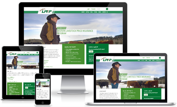
This is for the Western Livestock Price Insurance Program, and as you can see, it uses RWD in order to make it viewable on any web-capable device. RWD uses a single set of code to deliver a cohesive web experience to all users, no matter what their connection or screen size. And while the information here is not “structured” in the XML sense of things, a lot of IA work is still necessary to present the information in a way that is optimized for the user.
How RWD works and why you should care
Responsive Web Design uses CSS3 media queries to discover the width of the display being used (conveyed in the HTTP request to the web server) and customizes the width of the display to match that of the receiving device. It is a standards-based and device-agnostic approach, and works on all modern browsers. While there are thousands of different types of web-capable devices out there, they tend to come in only a small range of screen dimensions, so designs are crafted to fit the most common ones available. Up to a certain threshold or “breakpoint” the arrangement and display of items (including images and video) within the web page will resize and shift in order to make the best use of the available screen space. Everything works using a fluid design that uses percentages instead of fixed pixel-widths to define the layout and display of content, changing the flow of text and its size. Navigation also adapts to accommodate different screen sizes and to work with touch-based displays., And though they are trickier, data tables can also be made responsive and designed to progressively disclose information depending on the needs of the audience.
That last phrase is key: “depending on the needs of the audience”. This is why good RWD relies upon solid user-centric information architecture principles. IA considerations come into play dependent on how/when/why users are viewing your content and on content priority. RWD can and should be tailored to the needs of your audience.
There are several key reasons to go with RWD over tailoring your DITA HTML-output code to specific devices or creating an app for your content:
- RWD allows you to reach a wider audience (mobile as well as desktop)
- RWD reduces long-term costs of ownership, as you have a single web layout that you can use repeatedly
- RWD provides universal access to your content by users, and can be better tailored to your audience’s needs
The costs of creating a specific app for content is considerable, and needs to be updated on a regular basis in order to keep up with the design capabilities of new devices as they come online. And the plain non-responsive HTML output provided by the DITA-OT and other output engines inevitably results in frustration by users trying to access your content using a mobile device.
A presentation by the DITA-expert JoAnn Hackos earlier this year helped put this into perspective for me. In a survey her firm did late last year, technical communicators were asked two questions: “how do you publish content today?” and “how do you plan to publish your content in 2-3 years?” What struck me was the difference between the two answers:
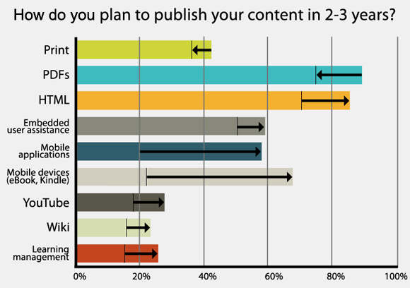
[Reproduced with permission]
As you can see, tech communicators are planning on producing less static PDF content – the first time that has ever happened since Adobe released the standard – and want to release more HTML-based material as well as more content for mobile applications and web-capable devices.
RWD provides a single means for producing content that meets all three of these content delivery needs.
Why DITA and RWD go so well together
RWD works best when text content is well-written and focused squarely on the user’s needs. And let’s face it, most web-based content is neither. As layout shifts at different screen resolutions, the best content for RWD comes from bite-sized chunks of information rather than long-form “pages”. Even better if these chunks are reusable so you can better predict what information will be displayed. Any of this sounding familiar to the DITA folks out there?
Whether or not they are familiar with the term, most people working with DITA are also familiar with the concept of content models, which looks at how chunks of information come together and work in flows. RWD is not a one-size-fits-all approach – at its core it’s a philosophy that can include many other aspects, but it all revolves around using the right approach to meet the needs of an audience. Good user experience (UX) design is about appropriateness and effectiveness, so when you prioritize a design for content delivery you need to know what will be displayed where, and what the priority of that content is. RWD requires a well-thought-out, holistic design system. You have one design for all devices and contexts, and this is why cookie-cutter RWD templates fall short: they are not designed to meet the needs of your specific audience.
When designing responsive layouts, the designer needs to know which chunks of content have priority over others. What appears in a right-hand column in a standard desktop layout may get pushed below the point where it would initially be seen when that same webpage loads on a mobile device. By assigning priority to certain types of content, it is possible to have that same chunk of content appear at or near the top so that users don’t miss it.
This illustration is derived from a well-known example of misplaced content priority. The same concept applies when thinking about where you want a table of contents to appear, or related links, or any other DITA-driven content. RWD can also solve some non-DITA specific issues, including those related to accessibility and handling location-based content.
DITA + RWD combines structured content with user centered experience across all devices. Talk to us at Yellow Pencil to get the best of both worlds!
Don’t forget to register for the free webinar on this subject happening on Thursday, June 12th!